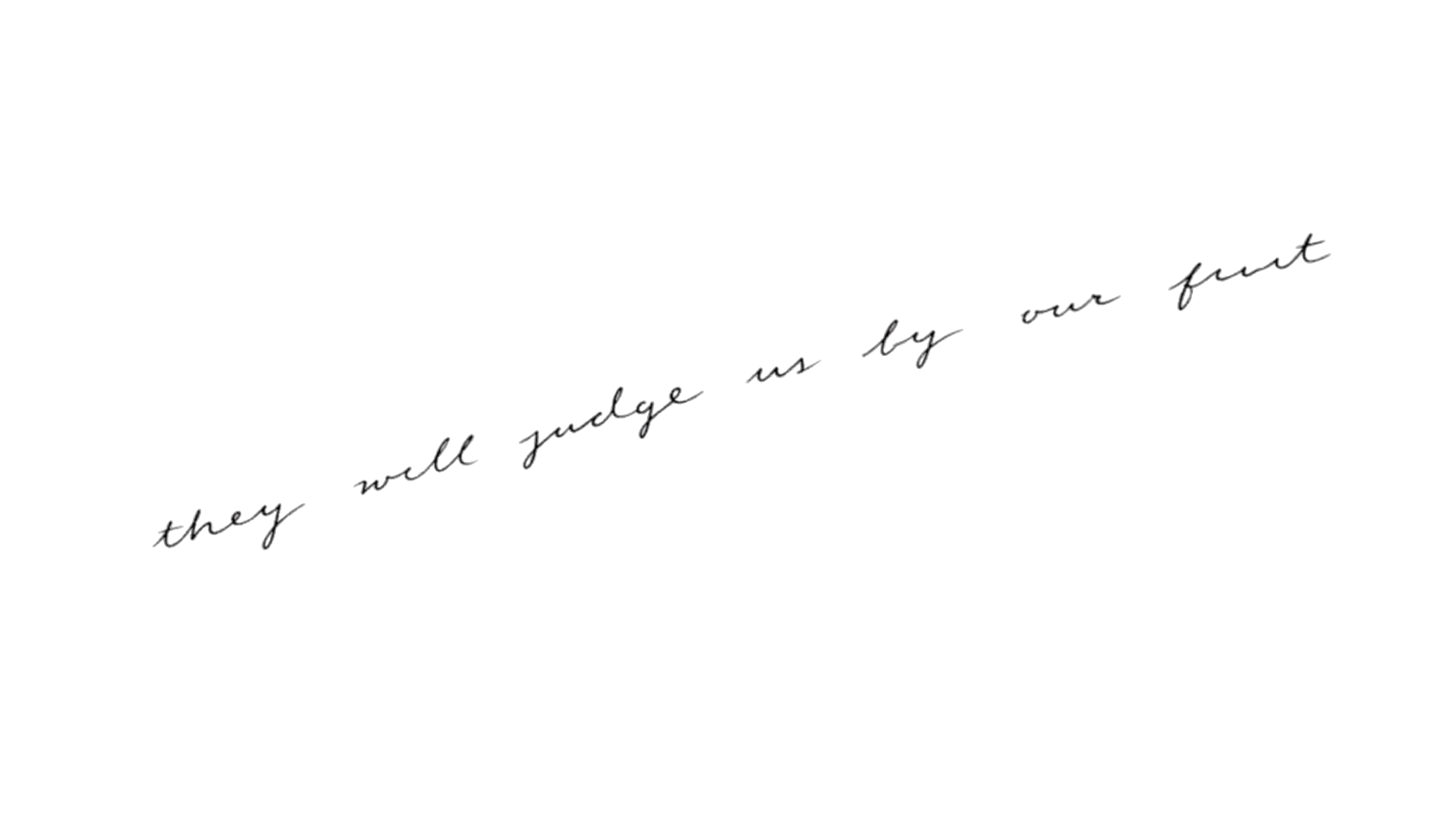
Fine-line lettering recurs in Tatty’s current catalog as a way to make the words part of the composition rather than a caption added afterward. This page compares those authored examples only; it does not claim wider popularity or growth.
Direwolf and The pack survives forearm tattooView design ↗
Evidence boundary: This page describes 4 matching designs in Tatty’s current authored collection of 13 source-backed records. It is a catalog observation, not a claim about broader popularity.
Note 01
What repeats in this catalog
The matching designs use text at different scales and in different relationships to the body. Some make a phrase the central image; another pairs lettering with a recognizable animal mark.
The useful pattern is compositional: the text has a defined role. That offers a better starting question than whether lettering is generally on trend.
Compare text-only and image-plus-text designs
Notice whether the words follow or resist the body line
Identify the phrase’s visual role
Note 02
How to use the observation
If the direction appeals to you, decide what the words should do before choosing a font. They can read like a note, a declaration, a label, or an integrated line within a larger image.
Then create alternatives that preserve that role while changing the letterform and layout. This keeps the catalog observation useful without turning one example into a template.